UMe
Bringing personality to banking
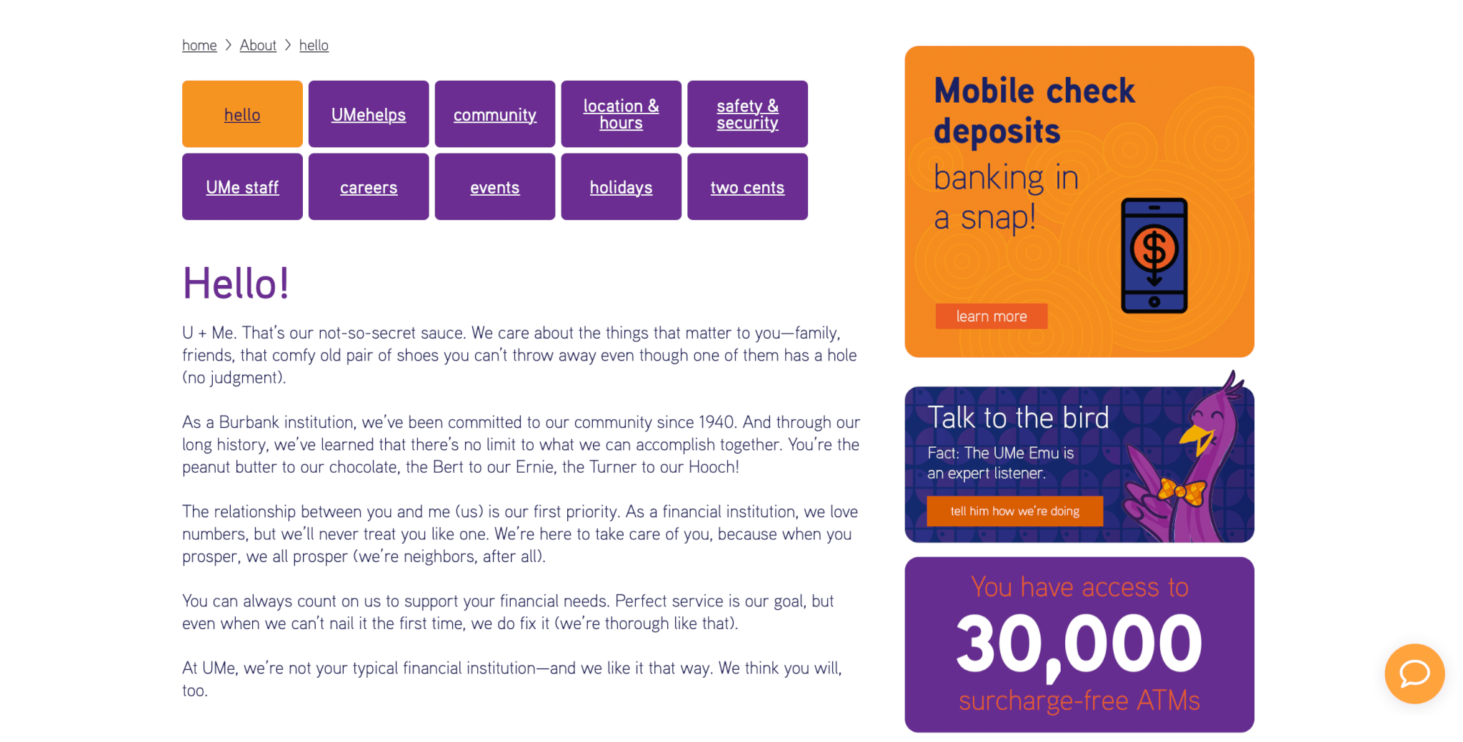
When most of us think of where we bank, genuine, fun, and enthusiastic aren’t characteristics that come to mind. But that was truly the experience at Burbank Community Federal Credit Union. With a confusingly similar name to a local competitor and a newly reimagined building, the opportunity for this local financial institution to build a brand that truly captured its operational essence that would stand out in the market. And the best thing? The credit union committed to doing things right—developing its brand from the ground up. It started with a foundational brand platform and ended up with a new name (Ume) and attention-grabbing marketing.
CLIENT
UMe Federal Credit Union has been a Burbank institution since 1940 when it got its start out of a teacher’s desk drawer. A lot has changed since the company’s humble beginnings, but UMe’s more than 16,000 members can still count on a banking experience focused on them.
PROJECT
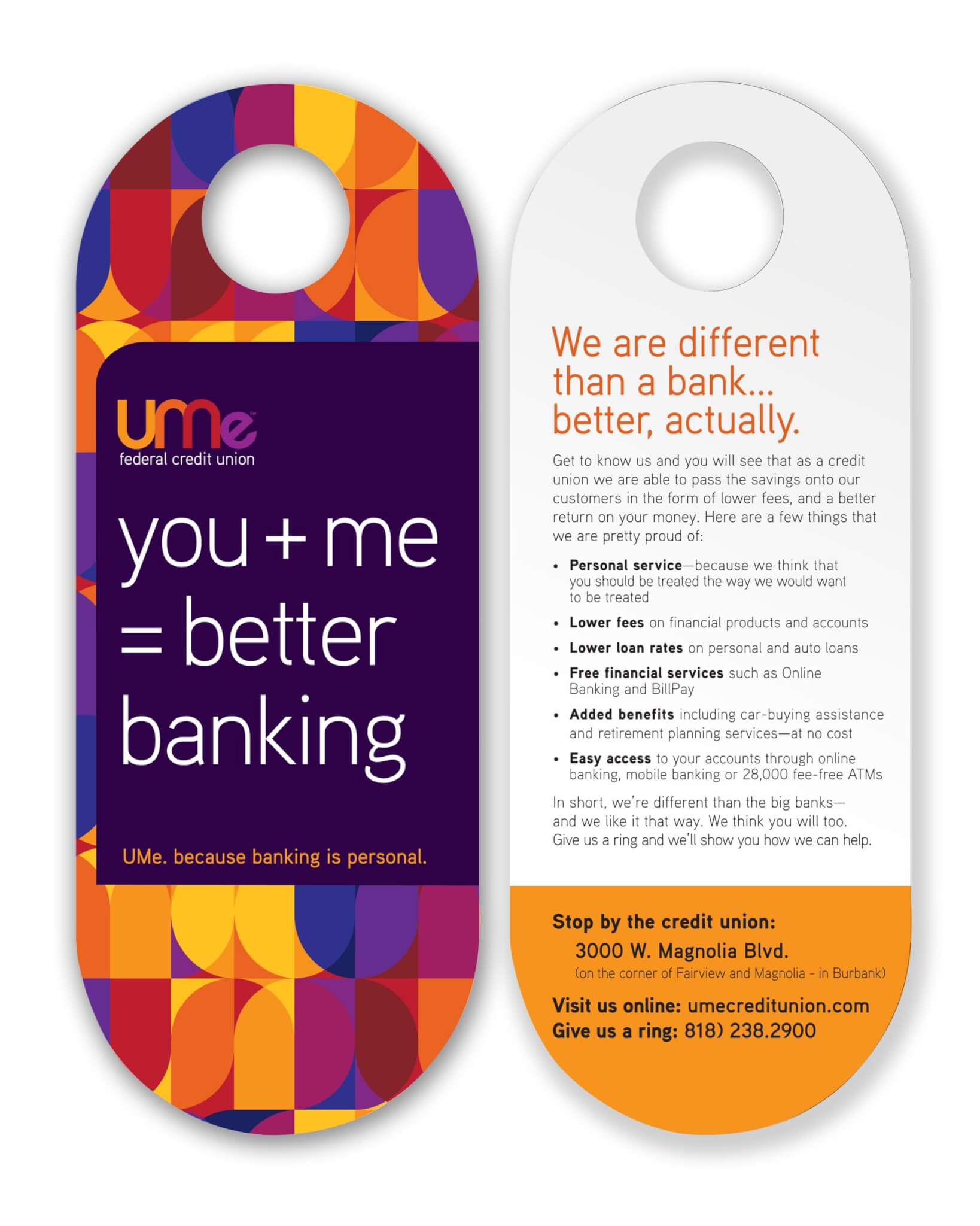
While the credit union knew they needed a new name, they quickly realized that establishing a brand platform would give them a stronger foundation for the name, tagline, visual style, and ongoing communications.
WHAT WE DID
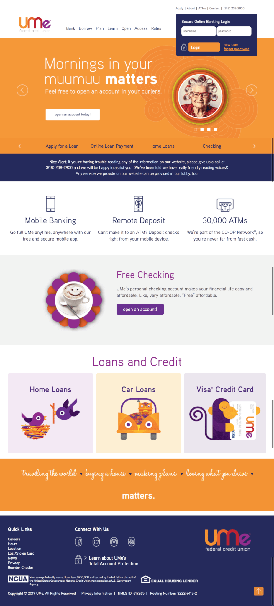
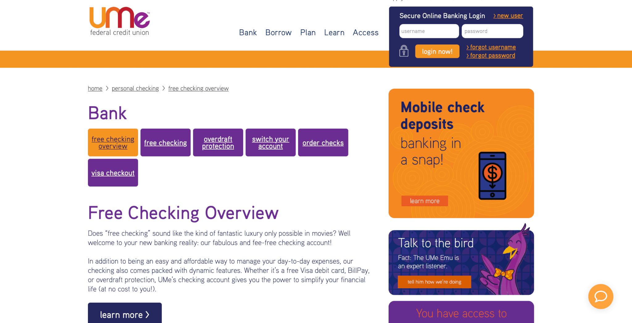
In collaboration with Magnitude Design and a committed group of stakeholders at the credit union, we crafted the brand platform (positioning, promise, personality), the new name (UMe), as well as a tagline — Because money is personal. And a compelling brand was born.